

I had an email question from Tammy in Canada about how I do my hand applique letters on my quilts. I thought I would take a few moments and do a quick, sort of crude tutorial.
Letters can be a fun addition to a quilt where you want to add your name and/or historical info. I love looking at antique quilts where the maker put her/his name, initials and/or a date. It makes the quilt so much more personal to me. Of course, they may not be appropriate on all tops.
I used them A LOT in my "Contentment" anniversary quilt top, which has a folksy, whimsical content.

I don't have an art background, but I will share what I do. There may be alphabets commercially available out there to use, but I just construct my own.
I work with tracing paper, a ruler, a pencil, an ultra-thin Sharpie marker and a good eraser.


I find that the width of my letters are variable...You can make your letters any size you want. First, I will show you how I make 2-1/2 inch tall letters. I draw two parallel lines, 2-1/2 inches apart...easy when I use my 2-1/2 inch rotary ruler!
That determines the height. Then I pencil in crude lines to help determine the width. You can make them as fat or thin as you like.
"W's" are wide, "I's" are skinny. I think it looks too formal and boxy to try and make all the letters the same width.

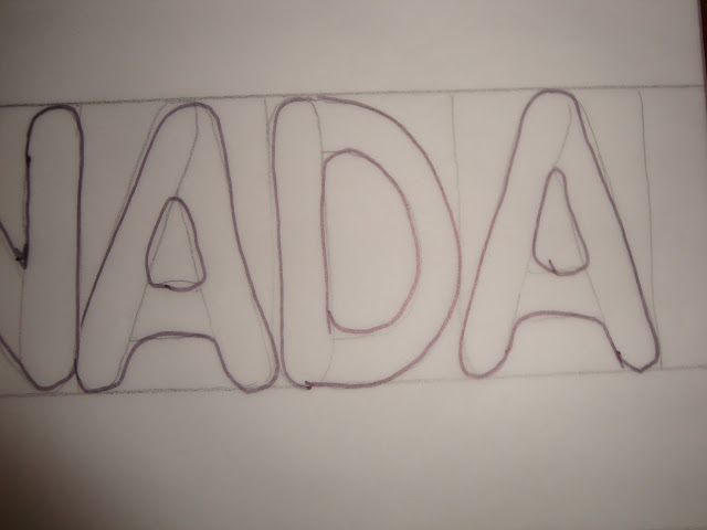
Then I just lightly sketch in skinny, rounded rectangles for each piece of the letter, overlapping my little "balloon" rectangles.

Then, I go over the whole letter shape with a Sharpie and round over the intersections of my sketched pencil "balloons."

I don't mind having inside "corners" to stitch (like the inside of the "R"), but I totally avoid pointy outside "corners."
This rounded style makes hand stitching easier and faster for me later because I usually reinforce pointy things with extra stitches.
Also with my glue-under method of needle turn applique, pointy areas have more layers of fabric and glue to stitch through...and they take a little longer to prep.

Here is an example of making 4 inch letters where some are lowercase. I add a dotted guide line a little higher than the halfway point.

That dotted line could have even been a little higher...that would give more room to do the lowercase letters...especially their "insides," like on the lowercase "e."


Since Tammy from Canada made the request, I thought I would use a phrase she would like, but I should not have spelled "Oh" with an "h," LOL! These letters are 2 inches tall. I also showed some shorter ones, more the size that some people use to sign their quilts.
You may have noticed that when I go over them with my sharpie, I take a few liberties in making them a little fatter or skinnier in areas. I just feel this adds some personality, but that is just my personal preference.
I sometimes like to substitute shapes for a letter, like the "heart" for the "o" in "love."
Since I usually do this doodling/tracing quickly, the personality comes mostly from me not tracing very accurately. :o)

You can see below where I made adjustments in my cruder pencil sketch when I went over things with my Sharpie. I also don't try too hard to make repeated letters in a word exactly the same.


If I need a lot of letters for a project, I construct an alphabet then just use tracing paper to shape my words or phrases (and if I was smart, I would save this one!). I am not even sure I draw them the same way each time...sometimes my "J" has a line on the top, sometimes not.
Sometimes I will use a lowercase "i" just for fun with all the other capital letters.

You can see how I changed the shape as I went over this with my Sharpie...


Now I will use my constructed alphabet to compose some words on a curve, etc.
I just held this sheet with the curve on it OVER my alphabet page and traced whatever I wanted.

Examples 1 and 2, below, are done this way. On example 3, I tried to demonstrate letters leaning...not enough letters or room to show this properly on this example!
On example 2, I sneaked in lowercase "i" and "y."

Here I am overlaying my alphabet while trying to draw "good luck," while alternating the "lean" of every letter.


My eye is less critical of things leaning attractively than things meant to be completely straight...and failing.
Here are some examples of ways to use letters to sign your quilt and really make it your own.
On my "Civil War Bride" quilt, I tried to have my signature blend in with the bottom right corner border stems.

On my "Baltimore Rhapsody - Symphony" quilt, I had no choice but to put it in a more noticeable spot, but I used a light color fabric so it wouldn't stick out too much.

It can also be fun to add a bit of humor, like in my version of "Bunnies Prefer Chocolate."


The folksy style of the letters work well when you are literally using a shoehorn to fit them in the block...sometimes they end up on top of each other.


I think they are a fun addition, even if only used to initial and date your top. Have fun!
In stitches,
Teresa :o)


