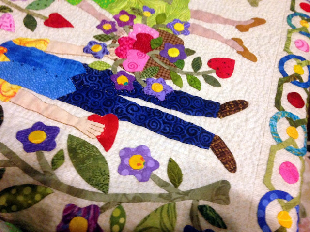
These are very poor quality pictures that I took late last night before going to bed following a long afternoon and evening of hand quilting. I thought I would show you where I am in the process of quilting my "Contentment" quilt top.
I am outline quilting every little piece, then echo quilting as a background fill. The quilt just seemed too busy to me to try and do anything more organized like background gridding or lines.
It will look better after a good pressing...I am quilting on a hoop and have the top all wadded up in my lap as I make progress. I tried stretching it out on top of the TV table I am using to take these poor pictures.
I started with the big 16-inch center block then proceeded into the twelve 10-inch surrounding blocks, heading toward the borders.
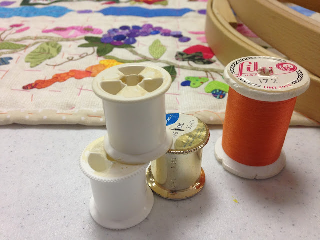
It is a lot of stitches! I have almost burned through my first spool of YLI hand quilting thread (#002 Ecru) and several layers of skin on my right thumb and left index and middle fingers.
It is pretty boring quilting until I get to something larger like the stork...then I can play with further quilting designs. THAT is really fun. My next project is going to have bigger motifs, LOL!
It seems like forever since I hand quilted something substantial, but fortunately the process is like riding a bike! I may not quilt today due to the heat...it is supposed to be 80 degrees! (And I have procrastinated so long that we have ZERO clean clothes.) If anyone has seen my winter season, please send it home! It is actually supposed to be 50 degrees tomorrow...better quilting weather.
I like hand quilting around the individual flower petals...the subtle loft of the quilt batt gives them an almost 3-D, slightly stuffed appearance.
I love running my hand over the surface of the quilt as I work. The feel of hand quilting is just so darn satisfying to me.
Last night I worked on the following block...I was actually hand quilting on a block of me hand quilting...it was like the Twilight Zone.
If I can keep this pace going, I will get it done before the Sauder Village Show in NW Ohio, which also means I will make the deadline to submit it to the juried AQS Grand Rapids show...yippee!
Thank God for DVD's...I just finished watching the second season of "Poldark."
In stitches,
Teresa :o)
More recycling...I used up the rest of 3+ spools (and one white bobbin!) of my Mother's old polyester thread to baste my "Contentment" quilt.
She used to keep her spools of thread in a clear, large pickle jar on a sunny window shelf...over time, all the spools were naturally variegated!
I think this is the most I have ever basted any quilt top of any size...I don't want this sucker to shift while I am hand-quilting with a hoop!
There is a lot of turning that hoop while outline quilting around all these shapes!
I watched my new Season One DVD of PBS's "Victoria" and re-watched Seasons Two and Three of "The Big Bang Theory" while doing all this basting.
As I start hand quilting, I am enjoying a "Harry Potter" home film festival!
Basting threads are pink, orange, teal and white...
I have started to quilt the center, largest block. I am outlining, then I am doing a close echo/fill. It is the first time I have quilted like this, and I am a little nervous about it, but the applique is so busy that it makes any kind of gridding or straight parallel lines indistinguishable. Even the outlining is extremely hard. Oy! What was I thinking!
Steve saw my close basting and thought I had already quilted it, LOL!
In stitches,
Teresa :o)
I had an email question from Tammy in Canada about how I do my hand applique letters on my quilts. I thought I would take a few moments and do a quick, sort of crude tutorial.
Letters can be a fun addition to a quilt where you want to add your name and/or historical info. I love looking at antique quilts where the maker put her/his name, initials and/or a date. It makes the quilt so much more personal to me. Of course, they may not be appropriate on all tops.
I used them A LOT in my "Contentment" anniversary quilt top, which has a folksy, whimsical content.
I don't have an art background, but I will share what I do. There may be alphabets commercially available out there to use, but I just construct my own.
I work with tracing paper, a ruler, a pencil, an ultra-thin Sharpie marker and a good eraser.
I find that the width of my letters are variable...You can make your letters any size you want. First, I will show you how I make 2-1/2 inch tall letters. I draw two parallel lines, 2-1/2 inches apart...easy when I use my 2-1/2 inch rotary ruler!
That determines the height. Then I pencil in crude lines to help determine the width. You can make them as fat or thin as you like.
"W's" are wide, "I's" are skinny. I think it looks too formal and boxy to try and make all the letters the same width.
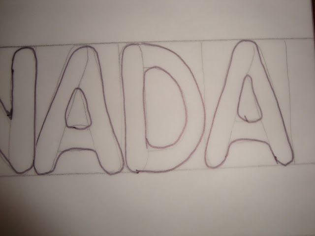
Then I just lightly sketch in skinny, rounded rectangles for each piece of the letter, overlapping my little "balloon" rectangles.
Then, I go over the whole letter shape with a Sharpie and round over the intersections of my sketched pencil "balloons."
I don't mind having inside "corners" to stitch (like the inside of the "R"), but I totally avoid pointy outside "corners."
This rounded style makes hand stitching easier and faster for me later because I usually reinforce pointy things with extra stitches.
Also with my glue-under method of needle turn applique, pointy areas have more layers of fabric and glue to stitch through...and they take a little longer to prep.
Here is an example of making 4 inch letters where some are lowercase. I add a dotted guide line a little higher than the halfway point.
That dotted line could have even been a little higher...that would give more room to do the lowercase letters...especially their "insides," like on the lowercase "e."
Since Tammy from Canada made the request, I thought I would use a phrase she would like, but I should not have spelled "Oh" with an "h," LOL! These letters are 2 inches tall. I also showed some shorter ones, more the size that some people use to sign their quilts.
You may have noticed that when I go over them with my sharpie, I take a few liberties in making them a little fatter or skinnier in areas. I just feel this adds some personality, but that is just my personal preference.
I sometimes like to substitute shapes for a letter, like the "heart" for the "o" in "love."
Since I usually do this doodling/tracing quickly, the personality comes mostly from me not tracing very accurately. :o)
You can see below where I made adjustments in my cruder pencil sketch when I went over things with my Sharpie. I also don't try too hard to make repeated letters in a word exactly the same.
If I need a lot of letters for a project, I construct an alphabet then just use tracing paper to shape my words or phrases (and if I was smart, I would save this one!). I am not even sure I draw them the same way each time...sometimes my "J" has a line on the top, sometimes not.
Sometimes I will use a lowercase "i" just for fun with all the other capital letters.
You can see how I changed the shape as I went over this with my Sharpie...
Now I will use my constructed alphabet to compose some words on a curve, etc.
I just held this sheet with the curve on it OVER my alphabet page and traced whatever I wanted.
Examples 1 and 2, below, are done this way. On example 3, I tried to demonstrate letters leaning...not enough letters or room to show this properly on this example!
On example 2, I sneaked in lowercase "i" and "y."
Here I am overlaying my alphabet while trying to draw "good luck," while alternating the "lean" of every letter.
My eye is less critical of things leaning attractively than things meant to be completely straight...and failing.
Here are some examples of ways to use letters to sign your quilt and really make it your own.
On my "Civil War Bride" quilt, I tried to have my signature blend in with the bottom right corner border stems.
On my "Baltimore Rhapsody - Symphony" quilt, I had no choice but to put it in a more noticeable spot, but I used a light color fabric so it wouldn't stick out too much.
It can also be fun to add a bit of humor, like in my version of "Bunnies Prefer Chocolate."
The folksy style of the letters work well when you are literally using a shoehorn to fit them in the block...sometimes they end up on top of each other.
I think they are a fun addition, even if only used to initial and date your top. Have fun!
In stitches,
Teresa :o)
"Contentment" is a flimsy!
Now to sew a seam on the backing and get this thing basted for hand quilting. I don't see how I can do much more than outline and echo quilt...it is soooo busy already. I will study it as I baste and see what comes to mind...
It is a hair over 59-inches square, which I hope makes it legally a wall hanging.
In stitches (and doing a happy dance!),
Teresa :o)
The final, longest border is finished for my "Contentment" anniversary quilt...happy feet, happy dance!
It will go across the top. The left and the right border ends are more or less mirror images of each other, with different fabrics.
Here are some closer pictures, from left to right.
I decided not to put our names or the wedding date around the wedding rings due to the fact that those little tidbits are already incorporated into some of the individual blocks.
I really hunkered down this week to get this finished as my email and housework lanquished! Due to the way I designed the outer borders, they have gotten progressively longer as I have stitched them...I should have started with this one first!
It will be nice to get my work area straightened up after having over 1000 tiny bits at loose ends during the process of getting the four borders prepped and finished.
I hope to work on top assembly this afternoon and evening. Now we will see how accurate my math was as I was designing, LOL!
In stitches,
Teresa :o)


